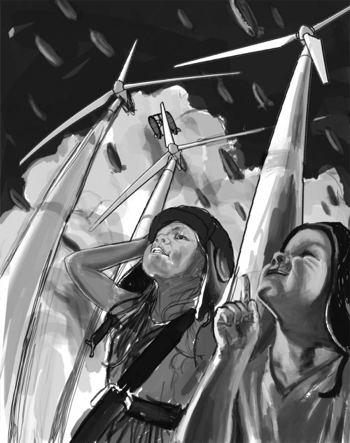
Illustration for Applied Arts Advertisement
Good day everyone. I’ve recently completed my illustration for an ad for our Applied Arts advertisement. This image will appear as an ad in the Applied Arts magazine in the June/July Photography and Illustration Annual and we will receive 250 art cards to use as self promotion. I had an amazing time working on this piece. It was very challenging and pushed me, which is a really good thing. I’ve included here a small step by step to give you some insight into the process I followed for the piece. I hope you find this enjoyable to read.
Step 1. Idea and Photo reference.
So the idea for the image just kind of came to me as I tried to think of what to do for the ad. As you’ll see it did evolve slightly as the process carried through.
I shot my own photo reference for the kids, yes those are my munchkins. You can see these 2 images were used in the rough layout of the composition below. I frankensteined her arm in from the second photo. You can also see that the windmills were brought in for the layout stage. I used Sketch Up … a free 3d program to get a basic windmill and then put them on the posts. I moved the camera around in Sketchup until I had the angle I wanted and exported the image to a png file. Then brought that into photoshop and distorted them to get that curve to them.
Step 2: Begin Painting.
I started working on the background keeping everything on separate layers for ease of editing at this point. You also might be able to pick out a wireframe zeppelin in the background. That too was a sketch up item. Sketch up offers a ton of free 3d models for this kind of thing.
Step 3: More Painting
I started by doing a quick line drawing over the reference. Yes… over the reference. My goal here wasn’t to prove that I can draw from observation. That I know I can do so for expediencies sake I did a quick *gasp* trace then removed the reference of the kids from the file and opened the reference on my other monitor. Then I began painting by looking at the reference and blocking in tone and form. During this process I realized I didn’t like the way the little guy’s arm was coming in through the bottom of the image and removed it. During this phase of the painting I worked in grayscale so that I could focus on the forms, light and composition and not have to worry about colour.
Step 4: Adding colour.
Adjusting the overall colour using the selective colour tool in photoshop allowed me to work from a base that wasn’t black and white.
The colouring is placed on a layer above the greyscale image set to colour mode. A non-destructive way to lay down some colour. You can see in this next series of images that I added colour and then decided… for some reason to go back to grayscale and work on some things more. I’m honestly not sure what all I was doing here but you can see some things change and some additions as they progress. They are presented below in order.


Ok. So I’m missing some steps. Sorry. I thought I had more. The next image you can see was brought from photoshop into painter 11 and reworked to have a more natural medium feel.
Above is a detail of the image to show you the brush work in painter.
I’m not sure what I was changing between these at this point. Tiny things like refining edges… or conversley softening edges.
At this point I thought I was pretty much done. I shared it with Kelly, my wife and Christy ( Kelly’s wife ). They are so awesome! They told me to push it in certain directions and not settle.. great feedback, very constructive and true. I left it for a day I think and stewed on having to work on it more.
Step 5: Refining and Pushing
When I came back to it and flipped the canvas to get a fresh look at it.
Then I noticed that something was wrong with the boy’s face. So I brought my reference in close to compare the two and make some corrections. Namely his mouth, eye, forehead and nose.
Ok.. Noticeably… I also painted more into the sky and added more colour. So I must have brought it out of painter back into photoshop, added more saturation and painted the sky.
I flipped it back again… added more saturation, added a second shirt on James under his other shirt, and repainted the clouds, zeppelins and other areas in painter again.
And there you have it. A finished piece. I am very pleased with it and look forward to doing more work in this approach. I hope you enjoyed this behind the scenes look!
Corey


Recent Comments