Character Design Process for Emerald Hills Shopping Centre
As one of the newer members of the Pulp Studios team, I have had some pretty awesome challenges and experiences already. As a “young” illustrator it has been very beneficial to my growth in my artistic skills and creative processes. Working within a smaller studio I feel I have had more “hands on”opportunities within projects than I would have starting out somewhere larger and that is something that I treasure.
A little while ago I was able to flex my character design muscles on a project we worked on with Phlo for a new mall called Emerald Hills Shopping Centre opening up soon in Sherwood Park. Phlo is based out of Vancouver and Edmonton and asked Pulp Studios to take care of the character illustration for the mall “mascot”. There was already a logo designed and we used that to pull our inspiration from. After a meeting where we all got to check out the logo and throw around some ideas/ time-lines, Pulp decided to let me roll with it (with some inspiring and very helpful art direction from Kelly).

The client had expressed that the demographic of the mall was 25-45 year old females and families that are of a higher education and income. Because of the forest-y feeling of the logo the client wanted a woodland creature. So we decided to keep it classy and go with something that was not too cartoon-y. Kelly, after speaking with the client, decided that we should draw some inspiration from American Modernism, Charlie Parker in particular, because of the elegance of his sharp simplicity.

We decided to go with a bird and a squirrel. So I got to work on the silhouettes. If you are a regular Pulp blog reader (and you should be!) you will know by now how much we love our silhouettes. Dealing with just the shape of the character in the very beginning is crucial because it allows you to focus solely on the presence and weight, and when you find the right one, filling in the details becomes a lot easier.

Starting out I was really pumped about the owls so I got those out of the way and then tried some more types of birds and moved on to squirrels. Upon review Kelly felt we could use another round of birds as it needed some more cowbell!! Charlie (which I pushed more in Birds 03). I circled the clients picks above.
Now it was time to flesh out the characters. Reference is great at the beginning to get the wheels turning but it is also important to be true to your own artistic capabilities and create something truly unique. Which is what I tried to do with melding the sophistication of Charlie with my own style and a certain cuteness I was trying to accomplish with the rounder, bouncier animal shapes. Illustrating each character in the shades of the logo helped me focus on form line and value.

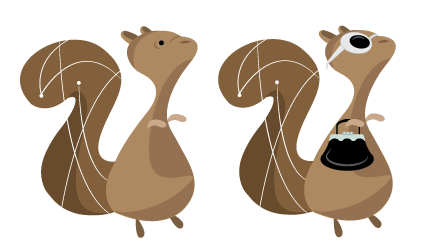
Upon some deliberation between Phlo, Pulp and the client it was decided that the squirrel was the all around favorite. The client was a little worried about the flexibility of the character (he wanted to be able to dress it up sometimes, sun glasses or a Santa hat for Christmas). We took this into consideration and I created a version all fancied up for a day at the mall. We also changed the colors which made the squirrel seem a little more cartoon-like. The client was happy, and I was able to gain some valuable character design skills. All around one of my favorite projects and I look forward to many more!


Recent Comments