Arrival Oil Tools Logo Case Study
In 2011, Arrival Oil Tools approached Pulp Studios for some small illustration and branding work. Since then our relationship has blossomed beautifully. Arrival Oil Tools are a graphic designers dream client. They’re bright, organized and are open to most creative approaches. They do not shy away from smart, subtle, iconic branding.
They specialize in the engineering and manufacturing of downhole drilling tools for the oil and gas industry. Which means new tools are being created on a regular basis. This logo study is on our latest and greatest for the, get this, Anvil Hydro-mechanical Drilling Jar.
First let us fill you in with some back-story on what exactly the Anvil Hydro-mechanical Drilling Jar is.
In a nutshell, after they dig the borehole for the pipeline, they feed piping down for…lets say…miles and miles. Over time the piping can become stuck together due to environmental factors. This is when the drilling jar comes in with it’s springs and steel, and it jar’s that baby apart, without any piping having to be removed. It’s really quite amazing once you wrap your mind around what these tools can do… If graphic design doesn’t work out I’m thinking about drillin’ me some oil!
Okay, Round 1 Version 1
Initially, I chose to make the letters in Anvil look squished together. I used the font Impact and thought the treatment turned out nicely. Especially since the client is a big fan of “comic style” fonts, and Impact is a great sister to pair with personality type. After the type treatment, I added a little texture, put it in a circle and placed a pair of faint arrows behind the type to hint the movement of the drilling jar. I usually side with iconic and subtle logos that aren’t trying to show off…but this one was my favorite, I just liked the way it felt.
Version 2
With this version I was, quite literally, just focusing on the fact that I could make the letters look like pipes…seems pretty silly at first, but after I started playing, it had a slight NASA feel and opened up some cozy negative space where I could fit the secondary type. The only thing I knew I would have to change was the weight of “Drilling Jar” due to legibility. But Anvil worked well, so in the good pile it went!
Version 3
On version 3 I kept on looking back to version 1, and wanted to incorporate the textured circle somehow. I made an icon based on the same background in version 1. I didn’t want the icon to be the highlight, but more of an accessory. I stuck with the same rotating arrows, and applied the same texture. This version didn’t give me the same warm fuzzy feeling as version 1, but that was okay because the type was the idea. Since the drilling jar uses a spring as one of it’s main components to jar the pipes apart, I cut a faint spring texture out of the type, and applied an offset graphic style. I think this turned out great. Every spot that was cut out was lined with a faint offset baby blue line that pushed the logo exactly where I wanted it to be. Unfortunately that crazy long secondary type was still left. I knew that with the type on the right I was pushing the overall length, but I wasn’t happy with it on the bottom so I tried my best to make it work.
Versions 1-3 were sent to the client for review and feedback.
Round 2
Number one didn’t make the cut unfortunately, but the client’s feedback helped to steer things in a positive direction. It doesn’t matter how many logos you make, it’s impossible not to have favourites, and to be somewhat disappointed when those little children don’t make their first flight. They loved the spring effect of version 3 and the piping letters of version 2. The icon from version 3 also seemed to impress them, and needed to live somewhere in the logo.
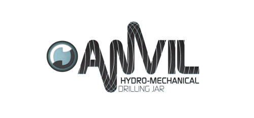
So my soloution was to mix the two separate and different designs into one mega, NASA, spring logo! In the end I had the room I needed to put the secondary type in comfortably. Overall, the project was a blast and I feel we came up with a great solution.
Here is the final design that was approved by Arrival Oil Tools. look for it next time you are jaring some pipe apart!


Recent Comments